
1. What you'll learn
- How to use several basic Animation APIs
2. Getting set up
- gradle 버전 업 경고가 뜰 시, 업그레이드 해주어도 무방하다. (시간이 부족하면 skip)
3. Animating a simple value change
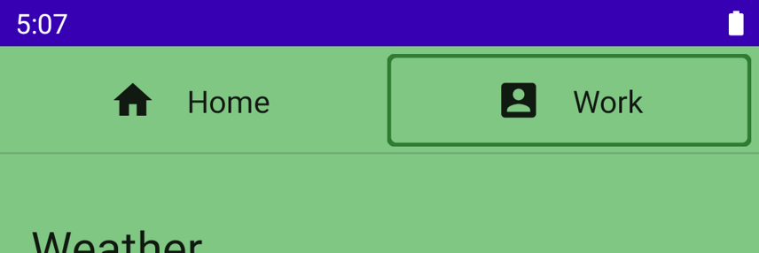
animate*AsState를 통해 간단한 값 변화가 일어나는 에니메이션을 줄 수 있다.- 코드랩의 경우 색상 변경 이므로
animateColorAsState를 사용할 수 있다.- return value 는
State<T>이므로by델리 게이터를 사용할 수 있다.
- return value 는
val backgroundColor by animateColorAsState(if (tabPage == TabPage.Home) Purple100 else Green300)4. Animating visibility
if (extended) {
    Text(
        text = stringResource(R.string.edit),
        modifier = Modifier
            .padding(start = 8.dp, top = 3.dp)
    )
}
위 에서 extended 에 따라 텍스트가 보여지고 가려진다. 이를 애니메이션 처리하는 것은 간단한데, AnimatedVisibility 를 사용하면 된다. (아래)
AnimatedVisibility(extended) {
    Text(
        text = stringResource(R.string.edit),
        modifier = Modifier
            .padding(start = 8.dp, top = 3.dp)
    )
}
@Composable
private fun EditMessage(shown: Boolean) {
// TODO 2-2: The message should slide down from the top on appearance and slide up on
// disappearance.
AnimatedVisibility(
visible = shown
) {
Surface(
modifier = Modifier.fillMaxWidth(),
color = MaterialTheme.colors.secondary,
elevation = 4.dp
) {
Text(
text = stringResource(R.string.edit_message),
modifier = Modifier.padding(16.dp)
)
}
}
}EditMessage 에서도 AnimatedVisibility 를 통해서 애니메이션을 생해주고 있다.
애니메이션 커스터마이징
AnimatedVisibility(
    visible = shown,
    enter = slideInVertically(),
    exit = slideOutVertically()
)
enter, exit 파라미터에 EnterTransition 인스턴스를 전달하여 커스텀이 가능하다.

아지만 slideInVertically , slideOutVertically 이 기본적으로 아이템의 절반 높이를 사용하기 때문에 자연스럽지가 않아보일 수 있다.
→ initialOffsetY 를 사용하면 이를 자연스럽게 할 수 있다. (initialOffsetY 는 람다로 요소의 높이를 받는다. 그리고 시작 지점을 반환한다.)
AnimatedVisibility(
        visible = shown,
        enter = slideInVertically(
            // Enters by sliding down from offset -fullHeight to 0.
            initialOffsetY = { fullHeight -> -fullHeight }
        ),
        exit = slideOutVertically(
            // Exits by sliding up from offset 0 to -fullHeight.
            targetOffsetY = { fullHeight -> -fullHeight }
        )
    ) {
        Surface(
            modifier = Modifier.fillMaxWidth(),
            color = MaterialTheme.colors.secondary,
            elevation = 4.dp
        ) {
            Text(
                text = stringResource(R.string.edit_message),
                modifier = Modifier.padding(16.dp)
            )
        }
    }
위 코드는 전체 높이 만큼 애니메이션 되도록 수정한 코드이다.

animationSpec 을 사용하면 애니메이션을 추가로 커스텀 가능하다. 어떤 식으로 값이 변경되는지 지정 할 수 있는 등.
AnimatedVisibility(
    visible = shown,
    enter = slideInVertically(
        // Enters by sliding down from offset -fullHeight to 0.
        initialOffsetY = { fullHeight -> -fullHeight },
        animationSpec = tween(durationMillis = 150, easing = LinearOutSlowInEasing)
    ),
    exit = slideOutVertically(
        // Exits by sliding up from offset 0 to -fullHeight.
        targetOffsetY = { fullHeight -> -fullHeight },
        animationSpec = tween(durationMillis = 250, easing = FastOutLinearInEasing)
    )
) {
    Surface(
        modifier = Modifier.fillMaxWidth(),
        color = MaterialTheme.colors.secondary,
        elevation = 4.dp
    ) {
        Text(
            text = stringResource(R.string.edit_message),
            modifier = Modifier.padding(16.dp)
        )
    }
}
5. Animating content size change
Column(
    modifier = Modifier
        .fillMaxWidth()
        .padding(16.dp)
        .animateContentSize()
) {
    // ... the title and the body
}
animateContentSize 를 통해 사이즈 변경 애니메이션을 줄 수 있다. 마찬가지로 animationSpec 를 통해서 커스터마이징도 가능하다. (See the Customizing Animations documentation for more information.)
6. Animating multiple values
복잡한 애니메이션을 만들기 위해서 Transition 을 살펴보도록 하자.
Transition 은 모든 애니메이션의 트랜지션이 끝나는 지점을 트랙할 수 있게 해준다.
이것은 animate*AsState 를 개별로 사용했을 때는 불가능 했다.
Transition 은 또한 transitionSpec 을 다르게 정의할 수 있게 해준다. 어떤 경우에? 각각 다른 상태 간에 트랜지션이 일어나고 있을 때.
예를 들면 현재는 탭 인디케이터 변경이 일어나면 사격형의 테두리를 보여준다.
val indicatorLeft = tabPositions[tabPage.ordinal].left
val indicatorRight = tabPositions[tabPage.ordinal].right
val color = if (tabPage == TabPage.Home) Purple700 else Green800
내부적으로 구현되어있는 것을 살펴보면, indicatorLeft 는 탭 라인에 있는 인디케이터의 왼쪽 가장자리의 위치이다. (즉 사각형의 좌변(?) 시작위치 이라는 것) indicatorRight 는 우변(끝 위치 가 되겠다.) 그래서 left, right 를 가지고 인디케이터 사각형 테두리 (Box) 를 그려주는 것이다. (물론 색상도 변경해주고 있다.)
이러한 다수의 값을 변경하여 애니메이션을 주기위해서는 Transition 을 사용하면 된다. 트랜지션은 updateTransition 함수를 통해서 생성할 수 있다. 현재 선택된 탭의 인덱스를 targetState 파라미터로 넘겨준다.
val transition = updateTransition(tabPage, label = "Tab indicator")각 값의 경우 animate* 확장 함수를 통해서 정의할 수 있다. 이때 람다로 타겟 값을 특정할 수 있다. (이 경우에는 이미 어떤 값을 타겟으로 해야하는지 알고 있으므로 그대로 래핑만 해주면 된다.
또한 by 델리게이트를 사용하여 정의하고 있다. (animate* 도 State 를 반환하는 함수이기 때문이다.)
val indicatorLeft by transition.animateDp(label = "Indicator left") { page ->
   tabPositions[page.ordinal].left
}
//...
val color by transition.animateColor(label = "Border color") { page ->
   if (page == TabPage.Home) Purple700 else Green800
}
val transition = updateTransition(tabPage, label = "Tab indicator")
val indicatorLeft by transition.animateDp(label = "Indicator left") { page ->
tabPositions[page.ordinal].left
}
val indicatorRight by transition.animateDp(label = "Indicator right") { page ->
tabPositions[page.ordinal].right
}
val color by transition.animateColor(label = "Border color") { page ->
if (page == TabPage.Home) Purple700 else Green800
}
적용하고 나면 보다 흥미로운 애니메이션을 감상할 수 있다. 여기서 애니메이션이 발생되게 하는 상태 값은 tabPage 이며 모든 애니메이션 값이 이 상태를 보고 타겟된 값으로 애니메이션을 show 한다.
추가로, transitionSpec 를 사용하여 애니메이션의 모습을 커스터마이징 할 수도 있다. (예를 들어 탄성 효과)
상태 변화의 방향을 결정짓기 위해transitionSpec 의 람다안의 중위함수인 isTransitioningTo 를 사용할 수 있습니다.
val transition = updateTransition(
    tabPage,
    label = "Tab indicator"
)
val indicatorLeft by transition.animateDp(
    transitionSpec = {
        if (TabPage.Home isTransitioningTo TabPage.Work) {
            // Indicator moves to the right.
            // The left edge moves slower than the right edge.
            spring(stiffness = Spring.StiffnessVeryLow)
        } else {
            // Indicator moves to the left.
            // The left edge moves faster than the right edge.
            spring(stiffness = Spring.StiffnessMedium)
        }
    },
    label = "Indicator left"
) { page ->
    tabPositions[page.ordinal].left
}
val indicatorRight by transition.animateDp(
    transitionSpec = {
        if (TabPage.Home isTransitioningTo TabPage.Work) {
            // Indicator moves to the right
            // The right edge moves faster than the left edge.
            spring(stiffness = Spring.StiffnessMedium)
        } else {
            // Indicator moves to the left.
            // The right edge moves slower than the left edge.
            spring(stiffness = Spring.StiffnessVeryLow)
        }
    },
    label = "Indicator right"
) { page ->
    tabPositions[page.ordinal].right
}
val color by transition.animateColor(
    label = "Border color"
) { page ->
    if (page == TabPage.Home) Purple700 else Green800
}
안드로이드 스튜디오에서는 컴포즈 프리뷰 에서 애니메이션 트랜지션 인스팩션을 지원한다. 이를 위해 interactive mode 를 클릭하여 애니메이션 프리뷰를 시작해야한다.
플레이 버튼을 눌러 애니메이션을 재생할 수도 있고, 식바로 움직여서 특정 지점일때 애니메이션을 직접 볼 수 있다. 라벨로 지정한 명칭으로 특정 애니메이션 값을 식별 가능하다.

7. Repeating animations
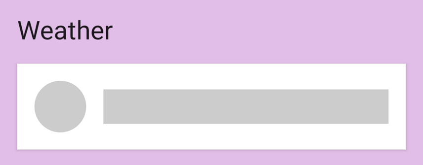
현재 코드랩에서는 날씨 새로고침을 하면 그저 회색의 임시 도형을 보여주는데, 사실 최신 날씨가 업데이트 되며 로딩이 되는 것을 유저에게 보여주어야 자연스럽다. 그럼 구현 해보자.
val alpha = 1f해당 값을 0 ~ 1f 까지 반복적으로 애니메이션 하려면 InfiniteTransition 을 사용하면된다.
Transition. 의 경우에는 state 가 변하는 것에 초점을 두고 애니메이션이 보여지지만, InfiniteTransition 의 경우에는 무한으로다가 보여준다.
InfiniteTransition을 만들기 위해서는 rememberInfiniteTransition함수를 사용한다.
InfiniteTransition 의 확장 함수인 animate* 꼴의 함수를 사용하여 값 변화를 줄 수 있다.
val infiniteTransition = rememberInfiniteTransition()
val alpha by infiniteTransition.animateFloat(
    initialValue = 0f,
    targetValue = 1f,
    animationSpec = infiniteRepeatable(
        animation = keyframes {
            durationMillis = 1000
            0.7f at 500
        },
        repeatMode = RepeatMode.Reverse
    )
)
반복 모드를 Reverse 를 주어서 0
1
0~1… 으로 반복되는 값으로 애니메이션 되도록 한다.
keyFrames 는 animationSpec 의 또다른 타입이다. 특정 밀리초 에서 값을 달리 설정할 수 있다.
animation = keyframes {
   durationMillis = 1000
   0.7f at 500
   0.9f at 800
}
키프레임을 추가할 수도 있다. (구간을 추가해 준다고 생각하면 된다.) (애니메이션이 왜 배터리를 갉아 먹는지 알것 같다..)
8. Gesture animation
사용자 터치에 기반한 애니메이션은 어떻게 주는지 알아보자. 코드랩 샘플에 있는 커스텀 Modifier 인 swipeToDismiss 를 사용할거다. 이 Modifier를 적용하면 터치로 스와이프 할 수 있게되는 컴포저블이 되게 되는 것이다.
해당 Modifier 가 적용된 컴포저블이 스크린 양옆으로 스와이프 되면 파라미터로 받은 onDismissed 콜백을 호출할 것이다. (여기서는 지우는 작업을 한다.)
cf. Compose Gesture documentation
유저 터치 기반의 좌우 스와이프 애니메이션을 줘보자.
pointerInput 수정자를 통해 들어오는 포인터 터치 이벤트에 대한 저수준 액세스를 얻을 수 있고 동일한 포인터를 사용하여 사용자가 드래그하는 속도를 추적할 수 있습니다. 항목이 해제 경계를 지나기 전에 손을 놓으면 항목이 제자리로 되돌아옵니다.
- 첫째, 진행 중인 애니메이션이 터치 이벤트에 의해 차단될 수 있습니다.
- 둘째, 애니메이션 값이 유일한 출처가 아닐 수도 있습니다. (애니메이션 값이 터치로 오는 값인지, 애니메이션 으로 인해 변경되고 있는 값인지 알 수 없다는 거인듯)
- 즉, 애니메이션 값을 터치 이벤트에서 오는 값과 동기화해야 할 수도 있습니다.
이러한 기능이 이미 있다. 예를 들어 제스처에서 들어오는 새 값에 즉시 스냅하고 새 터치 이벤트가 트리거되면 진행 중인 애니메이션을 중지하는 기능이 있습니다. Animatable 에 있다.
val offsetX = remember { Animatable(0f) } // Add this line
// used to receive user touch events
pointerInput {
    // Used to calculate a settling position of a fling animation.
    val decay = splineBasedDecay<Float>(this)
    // Wrap in a coroutine scope to use suspend functions for touch events and animation.
    coroutineScope {
        while (true) {
            // ...
애니메이션 도중에 stop 을 통해 애니메이션을 중단할 수 있다. 사용자 터치가 닿는 순간 기존 애니메이션을 중단하면된다. 물론 애니메이션이 구동중이 아닐 때는 stop 은 그냥 무시된다.
// Wait for a touch down event. Track the pointerId based on the touch
val pointerId = awaitPointerEventScope { awaitFirstDown().id }
offsetX.stop() // Add this line to cancel any on-going animations
// Prepare for drag events and record velocity of a fling gesture
val velocityTracker = VelocityTracker()
// Wait for drag events.
awaitPointerEventScope {
우리는 터치이벤트를 연속적으로다가 받게 될건데, 이를 애니메이션과 동기화 해줄 필요가 있다. (그래야 유저가 보기에 자연스러우니 당연하겠다.) 이를 위해서 snapTo 를 사용할 수 있따.
awaitPointerEventScope 및 horizontalDrag는 제한된 코루틴 범위이므로 다른 launch 블록 내에서 snapTo를 호출해야 합니다. 즉, awaitPointerEvents에 대해서만 일시 중지할 수 있으며 snapTo는 포인터 이벤트가 아닙니다.
horizontalDrag(pointerId) { change ->
    // Add these 4 lines
    // Get the drag amount change to offset the item with
    val horizontalDragOffset = offsetX.value + change.positionChange().x
    // Need to call this in a launch block in order to run it separately outside of the awaitPointerEventScope
    launch {
        // Instantly set the Animable to the dragOffset to ensure its moving
        // as the user's finger moves
        offsetX.snapTo(horizontalDragOffset)
    }
    // Record the velocity of the drag.
    velocityTracker.addPosition(change.uptimeMillis, change.position)

    // Consume the gesture event, not passed to external
    if (change.positionChange() != Offset.Zero) change.consume()

}
유저가 스와이프를 했을 때, 요소를 원래 위치로 다시 밀어야 하는지 아니면 멀리 밀어서 콜백을 호출해야 하는지 결정하기 위해 플링이 안정되는 최종 위치를 계산해야 합니다.
우리는 targetOffsetX를 계산하기 위해 이전에 생성된 decay 개체를 사용합니다.
// Dragging finished. Calculate the velocity of the fling.
val velocity = velocityTracker.calculateVelocity().x
// Add this line to calculate where it would end up with
// the current velocity and position
val targetOffsetX = decay.calculateTargetValue(offsetX.value, velocity)
이제 애니메이션 바운드를 정해줍니다. (삭제되거나 다시 원래대로 돌아갈 바운더리)
offsetX.updateBounds(
    lowerBound = -size.width.toFloat(),
    upperBound = size.width.toFloat()
)
실제 애니메이션 구동하기
launch {
    if (targetOffsetX.absoluteValue <= size.width) {
        // 충분히 빠르게 스와이프 하지 않은 경우 다시 0으로 돌려보낸다.
        // Not enough velocity; Slide back.
        offsetX.animateTo(targetValue = 0f, initialVelocity = velocity)
    } else {
        // 충분히 쓸어 날려준 경우 삭제해버리자
        // Enough velocity to slide away the element to the edge.
        offsetX.animateDecay(velocity, decay)
        // The element was swiped away.
        onDismissed()
    }
}
offsetX 에 값을 주었으니 이제 적용만 하면 될 터, 모든 애니메이션과 제스처가 설정되었으므로 x 값에 적용하자. 이렇게 하면 화면의 아이템이 제스처 또는 애니메이션에 의해 생성된 값으로 이동한다!
배운 것들
High-level animation APIs:
animatedContentSizeAnimatedVisibility
Lower level animation APIs:
animate*AsStatefor animating a single valueupdateTransitionfor animating multiple valuesinfiniteTransitionfor animating values indefinitelyAnimatablefor building custom animations with touch gestures
Reference
Jetpack Compose의 요소 애니메이션 | Android Developers
이 Codelab에서는 Compose Animation API를 사용하는 방법을 알아봅니다.
developer.android.com
2022.12.16 - [Android/Jetpack Compose] - [Jetpack Compose] view + xml 기반에서 컴포즈로 마이그레이션
2022.12.15 - [Android/Jetpack Compose] - [Jetpack Compose] 테마 Theming 기본 정리
2022.12.14 - [Android/Jetpack Compose] - [Android] compose basic state (상태의 기본 내용 정리)
'Android > Jetpack Compose' 카테고리의 다른 글
| [Jetpack Compose] 컴포즈에서 Navigation 사용하는 방법 정리 (2) | 2022.12.19 |
|---|---|
| [Jetpack Compose] 상태 및 사이드이팩트 고급 내용 정리 (State, SideEffects) (0) | 2022.12.18 |
| [Jetpack Compose] view + xml 기반에서 컴포즈로 마이그레이션 (1) | 2022.12.16 |
| [Jetpack Compose] 테마 Theming 기본 정리 (0) | 2022.12.15 |
| [Jetpack Compose] compose basic state (상태의 기본 내용 정리) (1) | 2022.12.14 |